Your A/B Test 'Winner' Is Lying to You
How Aggregate Data Hides Your Most Profitable Insights
Written by Hafiz Dhanani · Topics: A/B Testing, CRO, Google Ads (SEM), Google Optimize / Visual Website Optimizer, advanced statistical significance
At Rocket Doctor, when I was the first growth hire, we ran a test that looked, on paper, like a clean A/B win: clear lift, tidy p-value, obvious “ship it” decision.
At first glance, that’s exactly what it was. We had a winner, and it was statistically significant.
But once we pulled the result apart, the interesting part wasn’t the modest conversion lift.
It was what the average was hiding.
Here’s the experiment, what we saw, and why the top-line “winner” can sometimes be the least useful part of the whole exercise.
The Setup
We were running a high volume of spend on Google Ads (SEM) — basically our entire marketing budget. Any improvements in Cost Per Lead meant we could acquire more patients, extend our runway, and get more leverage from the same spend.
Since marketing owned the signup forms post-click, we could iterate quickly without engineering resources.
Our experiment’s core hypothesis was that users would respond better to seeing fewer fields at once.
More formally:
“By redistributing the patient intake fields from a single long page into a sequential, multi-step process, we will reduce the user’s perceived cognitive load and visual friction. This change is expected to result in a statistically significant increase in form completion rates (conversion rate) and a subsequent decrease in Cost Per Lead.”
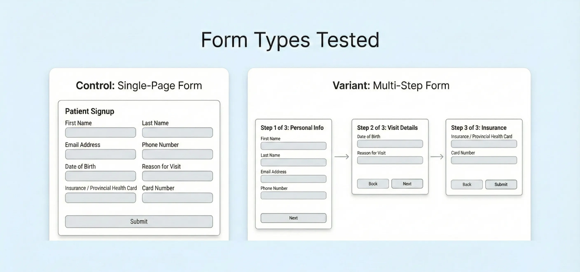
We decided to test two form variations:
Version A (Control): A single-page form collecting all patient information at once.
Version B (Experimental): A 3-part form that broke the same fields across multiple screens, asking patients to click “next” between each section.
The Initial Results
After 71 days and 23,273 sessions, the numbers came in:
Original Form: 2,887 conversions / 11,683 sessions = 24.71% conversion rate
3-Part Form: 3,008 conversions / 11,590 sessions = 25.95% conversion rate (+5.02%)
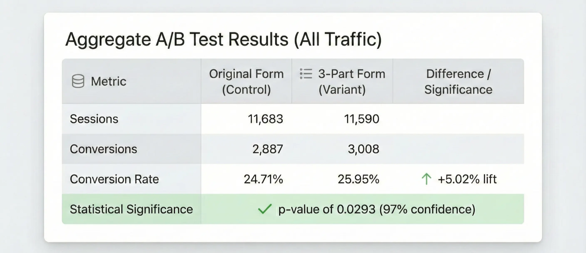
Google Optimize (RIP) reported a 91% probability that the experimental condition was better. When we ran it through Evan Miller’s statistical significance calculator at a 95% confidence level, we got a p-value of 0.0293.
Not bad for a quick form change, right?
We could have declared victory, rolled out the 3-part form to 100% of traffic, and moved on to the next test.
But we didn’t.
The Question That Changed Everything
Instead of stopping there, we asked two follow-up questions:
- Why did the split-up form work better?
- For whom did the split-up form work better?
Was it really true that people universally respond better to seeing fewer fields at once? Or was there a specific segment of users driving these results?
Segmenting by Device Type
The simplest segmentation available in Google Analytics is device type. When we looked at our traffic breakdown, we discovered that 73.28% of sessions came from mobile devices.
For a telemedicine business, mobile wasn’t a footnote. It was the majority of the funnel.
Here’s what the mobile segment revealed:
Mobile Traffic (17,082 sessions):
Original Form: 2,106 conversions / 8,575 sessions = 24.56% conversion rate
3-Part Form: 2,253 conversions / 8,507 sessions = 26.46% conversion rate (+7.82%)
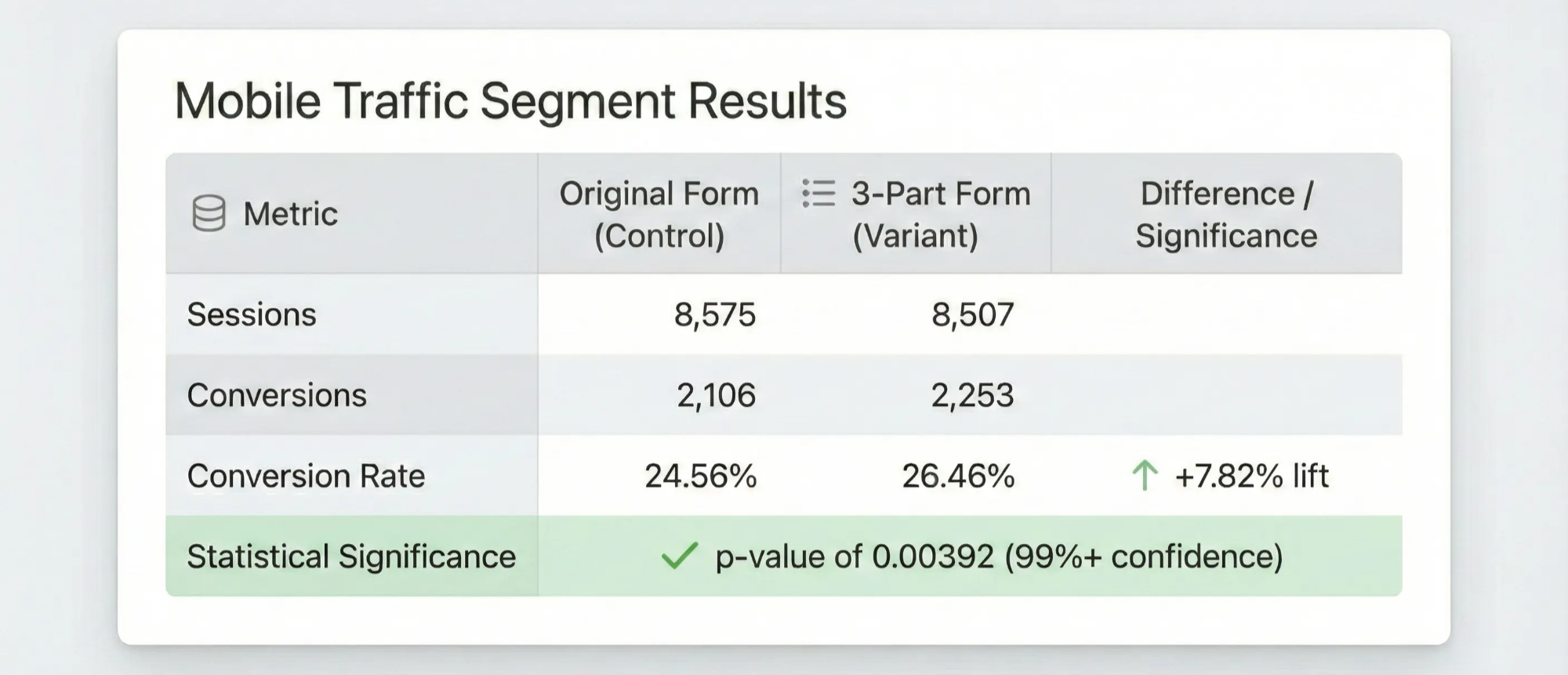
The lift on mobile wasn’t just higher than the overall average — it was 55% larger (7.82% vs. 5.02%). Even better, the p-value dropped to 0.00392.
Now the result looked less like a mild overall improvement and more like a strong mobile win.
But what about desktop and tablet users?
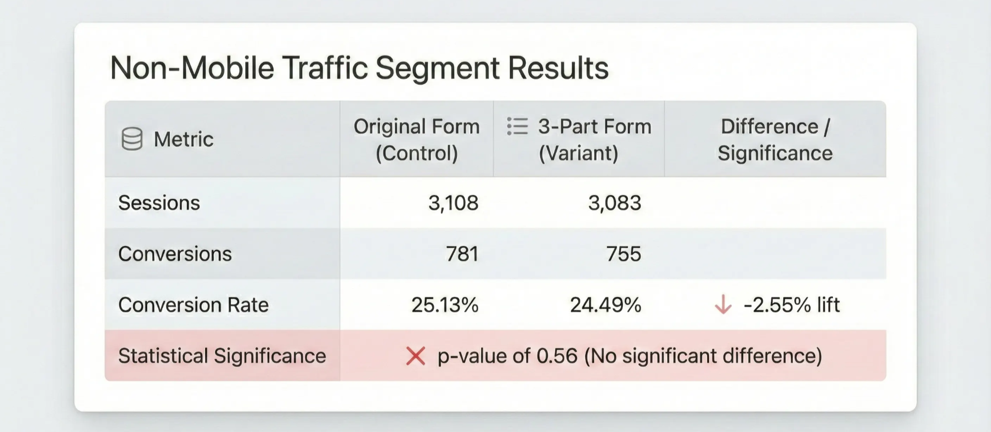
Non-Mobile Traffic (6,191 sessions):
Original Form: 781 conversions / 3,108 sessions = 25.13% conversion rate
3-Part Form: 755 conversions / 3,083 sessions = 24.49% conversion rate (-2.55%)
Wait — the experimental form actually performed worse on non-mobile traffic.
Was this statistically significant? No. The p-value of 0.56 was nowhere near the standard 0.05 threshold, meaning we couldn’t draw any real conclusion about which form was better for desktop and tablet users.
What This Actually Tells Us
Here’s the readout:
Aggregate level: The 3-part form won overall: 25.95% vs. 24.71% conversion rate (+5.02% relative lift, p = 0.0293).
Mobile segment: The lift was stronger on mobile: 26.46% vs. 24.56% conversion rate (+7.82% relative lift, p = 0.00392).
Non-mobile segment: The result was inconclusive: 24.49% vs. 25.13% conversion rate (-2.55% relative difference, p = 0.56).
The real story wasn’t “multi-step forms are better than single-page forms.”
The more useful read was narrower: most of the lift was coming from mobile users.
That tracks. On mobile, a long single-page form is harder to scan, harder to complete, and easier to bail on.
But the test didn’t prove that as a universal truth. It gave us a strong signal — and a much better hypothesis for the next round of testing.
Hypothesis: “A multi-step form will improve conversion more on mobile than on non-mobile because breaking the intake flow into smaller screens reduces scrolling, visual overwhelm, and perceived effort on small screens. On desktop, where users can see and complete more of the form at once, the benefit may be smaller or neutral.”
Why This Matters
The practical point: aggregate test results can answer the wrong version of the question.
The top-line result told us whether the 3-part form performed better across all traffic. But the more useful business question was narrower:
Should we treat mobile and non-mobile visitors the same?
In this case, the answer was probably no.
Mobile represented 73% of sessions, and the 3-part form showed a 7.82% relative lift in that segment. Non-mobile traffic, meanwhile, did not show a clear winner.
That distinction matters. The aggregate result alone would have told us what won. The segment readout helped us understand where the lift was coming from — and what we should probably test next.
This also matters for “flat” tests.
A top-line null result does not always mean “nothing happened.” Sometimes different groups of users respond differently, and the average washes out the useful pattern.
That is not necessarily a statistical false negative in the strictest sense. The aggregate test is still answering an aggregate question. But it can become a business false negative if it causes you to abandon a variant that works for a large, valuable segment of users.
The lesson isn’t “slice every dataset until you find something interesting.”
That’s how you fool yourself.
A better habit is simpler:
Keep a short, intentional list of segments you check because you have a real reason to believe they might behave differently. When you see an unexpected pattern, treat it as a strong candidate for the next test — not as a universal conclusion.
For form experiments, device type is one of the first segments worth checking because the experience genuinely changes. A long form on desktop is not the same thing as a long form on mobile. Screen size, scrolling, keyboard behavior, field visibility, and perceived effort all change how users respond to the exact same form structure.
One caveat worth naming: we checked device type after seeing the aggregate result, not before. That means I wouldn’t treat the mobile readout as pre-registered proof. But device type also wasn’t an arbitrary cut — it’s one of the first segments worth checking in a form test because the experience is materially different. The honest lesson, in hindsight, is to define the one or two segments you can actually afford to check before launching the test, then treat unexpected patterns as follow-up hypotheses, not universal conclusions.
In our case, segmentation suggested we weren’t just nudging conversion. We were likely reducing mobile-specific form friction.
That gave us a more useful roadmap than the aggregate p-value alone:
- roll out or prioritize the 3-part form where the evidence was strongest;
- watch non-mobile performance as a guardrail;
- follow up with tests around mobile form length, step count, progress indicators, and field grouping;
- avoid assuming the same form pattern should apply equally across every device type.
One more limitation: this analysis uses form submission as the conversion event. Rocket Doctor didn’t make money when someone submitted a form; it made money when that patient actually had a telehealth visit. A more mature program would ask whether the mobile lift carried through to booked visits, completed visits, and downstream value by segment. A few months into scaling Rocket Doctor from 0 to 175+ daily visits, form completion was the cleanest signal we had — and a reasonable one to act on — but it was still a proxy, not the final business outcome.
The lesson I took from this was pretty simple: the aggregate result told us which form won across the traffic we gave it. It did not tell us whether the same decision made sense for every user.
For this test, device type mattered because the experience was materially different. Filling out a long patient intake form on a phone is not the same thing as filling it out on a laptop.
Once we saw that most of the lift was coming from mobile, the next questions became much better: should the form pattern be device-specific, should we test step count or progress indicators, and should desktop even get the same treatment?
If you stop at the aggregate p-value, you may know which variant won.
But you may still miss the more valuable question: who did it work for, why did it work, and what should that teach you about the next experiment?
Written by Hafiz Dhanani